SEARCH
A great gift
for crisis deniers!
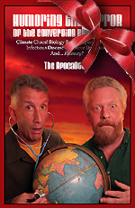
Humoring the Horror of the
Converging Emergencies
94 color pages
$24.99 now $15!
Or read FREE online!

Twitter

Ping this story
in social media:
del.icio.us
Digg
Newsvine
NowPublic
Reddit
Facebook
StumbleUpon
|
 |
|
 |
|
 |
|
 |
|
Why 2007 I.P.C.C. Report Lacked 'Burning Embers' Diagram http://apocadocs.com/s.pl?1235860060
Several authors of the 2007 report by the Intergovernmental Panel on Climate Change on the projected effects of global warming now say they regret not pushing harder to include an updated diagram of climate risks in the report. The diagram, known as "burning embers," is an updated version of one that was a central feature of the panel's preceding climate report in 2001. The main opposition to including the diagram in 2007, they say, came from officials representing the United States, China, Russia and Saudi Arabia. That frustration led them to seek publication of the climate-risk diagram in the Proceedings of the National Academy of Sciences. In emails and phone interviews over the past week, several of researchers said the diagram was omitted in favor of written descriptions of levels of risk from increments of warming.
Some scientists thought that the diagram's smears of color, reflecting gradients of risk, were too subjective. But Stephen H. Schneider, a climatologist at Stanford University who has been involved in writing the I.P.C.C. reports since 1988, said the real opposition came from a bloc of countries that thought the colorful diagram was too incendiary.... "Unfortunately governments of 5 fossil fuel dependent and producing nations opposed it.... No matter how much New Zealand, small islands states, Canada, Germany, Belgium and the UK said this was an essential diagram, China, the U.S., Russia and the Saudis said it was too much of a "judgment".
|
|
 |
|
 |
|
 |
[Read more stories about:
capitalist greed, climate impacts, death spiral]
|
 |
|
New!:
| |
|
No reader quips yet -- be the first! | |
|
Got a PaniQuip?
|
|
|
We reserve the
right to reuse, remove, or refuse any entry.
| |
|
|
'Doc Michael says:
|
|
|
 |
|
That information was too hot to handle.
|
|
Go to the NYT article itself to see the graphic, in all its incendiary detail.
|
|
|
Want to explore more?
Try the PaniCloud!
|